
Third weekend of September: Bristol Rhythm & Roots Reunion. I can remember sitting in what’s now Bristol Ballet looking out the window between Saturday rehearsals. The plucking of instruments mixed with laughter in crowds; the smell of funnel cake wafted through the trees and into our dance studio. After class, it was always a race to change and spend the rest of the day downtown! The anticipation of festival weekend looked different as I grew up, but the feeling of home has lasted even after moving away. That feeling led me to even conduct a final research project on the 2012 festival poster during my senior year at Carson-Newman.
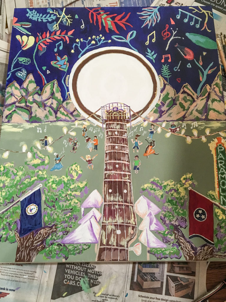
I knew I wanted to illustrate this feeling somehow, but had never tried. However, I thought to myself: “If I just paint something and text a picture to Rhythm and Roots, they may like it…maybe even use it!” Temporarily hijacking the mudroom of my house as an art studio, I had a vision: a banjo doubling as the moon with the neck as State Street and people dancing all around. Then I’ll throw in some state flags, lights, trees, and a few Bristol landmarks with a party of flowers in the night sky! The only problem with that? I’d finished the top half only, not the bottom, when I excitedly texted Leah Ross that first phone picture. I got more carried away by the day as I prepped it for showing, full of detail and ideas. And then I heard the good news: my design would be on the 2018 Bristol Rhythm festival poster.
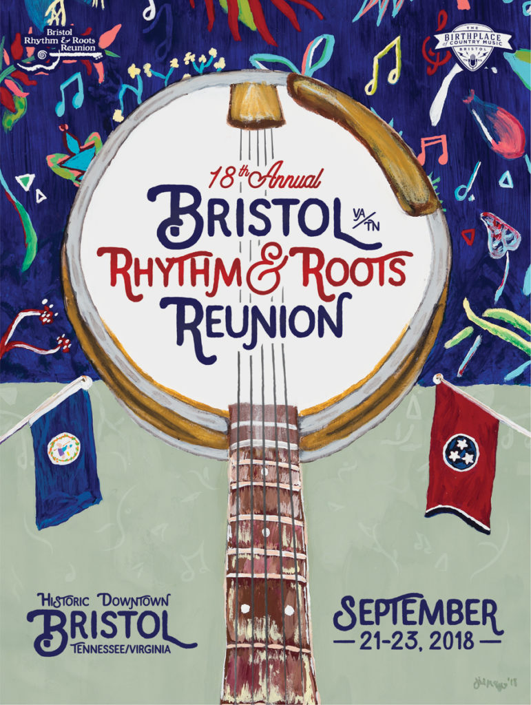
The lineup reveal a few weeks ago was a happy, happy ending (beginning?) for that 2018 festival poster. The process getting there taught me a great deal as an artist. After talking with so many people who also love their artistic side, I’m a firm believer in teaching what we know. The really cool thing about this adventure was that I was a total novice working with people I cared deeply about. I may hold a degree in advertising and have graphic design clients of my own, but had never undertaken a fusion of painting and advertising together – but I learned a lot through the process.
So the question is: Are you a painter hoping to showcase your work like this one day? If so, and whether it’s through a music festival or something else exciting, here’s what I learned that could help:
Great design is simple to understand: There’s a place for symbolism and double meaning in art, but a publicity piece isn’t it. If we’d left the banjo doubling as the moon and the neck doubling as State Street like the original design, your brain would fry like a prom queen in a tanning bed! Remember when Starbucks dropped their lettering to reveal only their green mermaid logo? Twitter threw a royal fit for a few days! But over time that attitude shifted. We all now clearly see that their logo is a mermaid because the letters were a busy distraction. This is one of those things that I knew was a common mistake in designing for advertising. But as an artist I needed to learn to slow my roll a tad if my design was going to work for clients.
Great design doesn’t let important information get lost: I loved this project so much, but the final look was a team effort. My original hand-lettering was pretty, but ended up being lost in the overall look so much that you had to really study the poster to figure out what it was even promoting. Now with the final design, you see the name of the festival and the date, special thanks to the graphic design team at Birthplace of Country Music (thanks for all of the enthusiasm, Hannah and Sarah!). We made the banjo more than double its size (I traced the baptismal font bowl from First Presbyterian Church for the correct diameter on the original!) in order to draw the eye to the lettering. And the t-shirts look marvelous thanks to the new font! Using the same blue as the background tied the whole thing together like magic.
Great design tells your story while also reaching your squad: The original poster design had the Paramount and Bristol signs. We’ve had these before in posters and they work! But how could we challenge ourselves? If we have people coming from Australia and Canada, what kind of poster would they want to take home? Maybe some variety could shift that “Oh, I bought a poster here already in 2000-whenever” into another purchase. And we all know that a purchase – as a tangible way to mark their experience – means they might just come back to the festival over and over. So instead of a Bristol landmark, I did the two state flags. Being in two places at once listening to live music is a great story anywhere! It also separates us geographically from other music towns like Nashville or Galax.
Finally, I think the bottom line with this year’s poster is that Bristol is legendary. People may not know about Bristol, but once you hear about it, you always respect it! This is true with its history, yes, but also the way musicians flock to us over and over. College for a Bristol kid means loading up the car on Bristol Rhythm weekend and bringing out-of-town friends home. Then those friends all have new favorite bands that go along with their memories of standing in the spot where it all began! For people who’ve lived here their whole lives, Bristol Rhythm and Roots Reunion gives a different feeling every year, yet the same traditions are honored and celebrated. I already have my Spotify full of Old Crow, War and Treaty, and Pigeon Kings, ready for the party that is Bristol Rhythm in September!
Jill McElroy is a Bristol native with a love of music and our festival. She decided to leave a full-time job last year in order to pursue starting a brand illustration and art business. She designs logos and personalities for other brands and has her first art series premiering this summer! As a former intern for Birthplace of Country Music, Jill’s feelings about being a festival poster artist can be summed up in one word: Joy!